
Most advice on color psychology in advertising is useless for paid media. It sounds smart in a branding workshop, then falls apart inside a Google Ads account where you need better click-through rate, stronger conversion rate, lower CPA, and clearer creative decisions.
The worst version is the recycled chart that says blue means trust, red means urgency, green means growth. That's lazy thinking. In PPC, color isn't a personality test. It's a performance variable. It changes what gets noticed first, what looks clickable, what feels on-brand, and what gets ignored.
That matters because color can account for up to 80% of brand recognition and contribute to up to 90% of a product's initial impression, according to the marketing research summary cited in this analysis of color in marketing. If your creative team treats color like decoration, they're leaving money on the table before the headline even has a chance to work.
A serious PPC operator doesn't guess. They build color into the same discipline they use for bidding, audience segmentation, landing page testing, and conversion tracking. That's the difference between specialist account management and generic agency process. A specialist asks which palette helps the right user act faster. A bloated agency usually asks whether the ad “feels premium.”
If you want extra background on how brands think about palettes outside the paid media lens, DesignStack's guide to brand colour is a useful reference. Just don't stop there. Brand color theory is the starting point. Paid performance is where the important work begins.
Table of Contents
Your Agency Is Wasting Money on Bad Color Theory - What bad color advice usually looks like - What a performance-first operator does differently
Why Universal Color Meanings Are a Myth - Context decides the meaning - Why generic agency advice fails - The better question for CMOs
Performance Principles for Ad Creative Colors - Contrast wins the click - Hierarchy controls what the eye does next - Discipline beats decoration
A Framework for Choosing Your Ad Palette - Start with the conversion event - Audit the auction, not your preference - Build a palette that can be tested - Adjust for market and device constraints
How to A/B Test Color in Google Ads - Test one color variable at a time - Match metrics to business outcomes - Use platform structure correctly
Improve Performance with Accessible Color Choices - Accessibility is conversion optimization - What strong PPC teams actually check
Your Agency Is Wasting Money on Bad Color Theory
Most agencies talk about color the way junior brand strategists talk about mood boards. They give you generic associations, then apply them across every campaign as if your category, offer, device mix, and audience behavior don't exist.
That approach breaks fast in paid media. An ad doesn't win because someone said orange feels energetic. It wins because the layout is readable, the call to action is obvious, the palette fits the offer, and the creative stands out in a crowded placement without looking sloppy.
What bad color advice usually looks like
You've probably heard some version of this:
Blue for trust: Used without asking whether every competitor already looks blue.
Red for urgency: Used even when red fights the rest of the composition.
Green for growth: Forced into categories where it signals the wrong thing.
More color variation for energy: Which often creates clutter, not attention.
That's not strategy. That's paint-by-numbers advertising.
Practical rule: If someone recommends a color before reviewing your auction landscape, landing page, and audience context, they're guessing.
What a performance-first operator does differently
A specialist looks at color inside the system:
Agency shortcut |
Performance-first approach |
|---|---|
Picks colors from brand guidelines alone |
Tests colors against CTR, CVR, CPA, and ROAS |
Uses broad emotional claims |
Evaluates visual fit for the offer and category |
Changes multiple design elements at once |
Isolates color variables so results mean something |
Optimizes for internal approval |
Optimizes for user response |
CMOs spending serious money on Google Ads should demand this level of rigor. You already expect controlled tests for bidding strategy, landing page layouts, and ad copy. Color deserves the same treatment.
The mistake isn't caring about color psychology in advertising. The mistake is treating it like abstract branding language instead of measurable ad mechanics. That's where agencies waste budget. They dress up opinions as strategy, then send you a report full of creative adjectives instead of performance evidence.
Why Universal Color Meanings Are a Myth
The biggest lie in color psychology in advertising is that colors carry fixed meanings across every audience and offer. They don't.
A color only works when it feels appropriate for what you're selling and for the context where the user sees it. Research summarized by Help Scout makes that point clearly: the relationship between brand and color depends on perceived appropriateness for the product category, which is why effective advertisers should treat color as a fit variable rather than a fixed emotional shortcut, as explained in Help Scout's discussion of color context in marketing.
Context decides the meaning
Green can suggest natural ingredients in one market and financial services in another. Black can signal luxury, simplicity, or intimidation depending on the offer and the surrounding design. Yellow can look optimistic or cheap.
The meaning isn't sitting inside the hex code. The meaning comes from context:
Product category: What users expect this type of brand to look like
Audience experience: What they've seen from competitors and similar offers
Placement environment: Search, Display, YouTube, Discovery, Gmail, and landing pages all frame color differently
Creative composition: The same color behaves differently against different backgrounds, text styles, and image treatments
Why generic agency advice fails
Large agencies love frameworks that can be repeated across accounts. That's efficient for them, but it's dangerous for your budget.
A junior account manager can memorize a chart. They can't reliably interpret whether your supplement brand should lean clinical, natural, premium, or disruptive in a category already filled with soft greens and sterile blues. That judgment takes category pattern recognition, ad testing discipline, and enough account experience to know when a color is helping the message and when it's just making the ad blend in.
If your team is asking “What does blue mean?” they're asking the wrong question. Ask “Does this palette fit the offer, the audience, and the auction?”
The better question for CMOs
Instead of asking for the emotionally correct color, ask for the strategically useful one.
Use this checklist in creative review:
Category fit: Does the palette look believable for this product?
Brand consistency: Does it still feel like us, not a random redesign?
Competitive differentiation: Will it stand apart from the ads around it?
CTA clarity: Does the action element get attention immediately?
Landing page continuity: Does the click lead to a visually coherent page?
That shift matters. It turns color from a branding debate into an operational decision. And once you treat color as a fit variable, you stop arguing about taste and start testing for response.
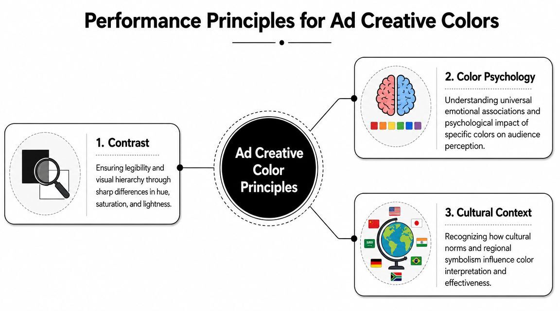
Performance Principles for Ad Creative Colors
Color in ad creative is not a branding discussion. It is a conversion variable. Treat it like one.
After enough audits across Display, Performance Max, and paid social companion assets, the same pattern shows up. Winning creatives use color to control attention. Losing creatives use color to decorate.
For inspiration on layouts and offers that look like paid media instead of student portfolio work, these effective PPC campaign examples are worth reviewing alongside your own asset library.
Contrast wins the click
Your audience is scanning fast, usually on a phone, often with weak intent. If the headline blends into the background or the CTA fades into the layout, the ad fails before the message has a chance to work.
That is why contrast matters more than symbolic color meaning in performance media. Red, green, blue, or orange can all work. The deciding factor is whether the user can identify the offer, process the hierarchy, and spot the action in under a second.
Use contrast to make three things obvious:
Headline legibility: The core message should read instantly on small screens
CTA visibility: The action element should look clickable, not ornamental
Offer separation: Pricing, promos, and key claims need visual distinction from supporting copy
Hierarchy controls what the eye does next
High-performing ads do not spread emphasis evenly. They assign jobs to colors.
One dominant color sets the frame. One accent color points to the action. Neutrals keep the rest of the layout from competing with the conversion path. At this juncture, many agencies waste spend. They confuse variety with impact, then ship creatives where badges, icons, buttons, and background shapes all fight for the same attention.
Review your color choices against the message structure, not against a mood board. A useful companion exercise is to compare your visuals with these Google Ads copy examples. The strongest ads align copy hierarchy and color hierarchy so the viewer knows what to read first and what to click next.
Your accent color should mark the action. If it is highlighting five other elements, it is not an accent. It is clutter.
Discipline beats decoration
A lot of weak creative looks polished at first glance. It still underperforms because the palette is doing too much.
Over-saturated backgrounds, extra highlight colors, and inconsistent weighting make ads feel cheap, especially in high-CPC categories where trust affects response. Strong performance creative usually stays restrained. Use a stable base palette, keep the number of competing colors low, and reserve the highest-contrast treatment for the conversion point.
A simple dominant-and-accent structure is enough for most campaigns. It gives the eye a focal point, keeps the ad credible, and makes color testable inside Google Ads instead of turning every creative review into a subjective brand debate.
A Framework for Choosing Your Ad Palette
Brand guidelines are a constraint, not a strategy. CMOs who treat color as a fixed identity asset usually end up with ads that look consistent and perform like wallpaper. Build the palette around the conversion job first, then force the brand system to support it.
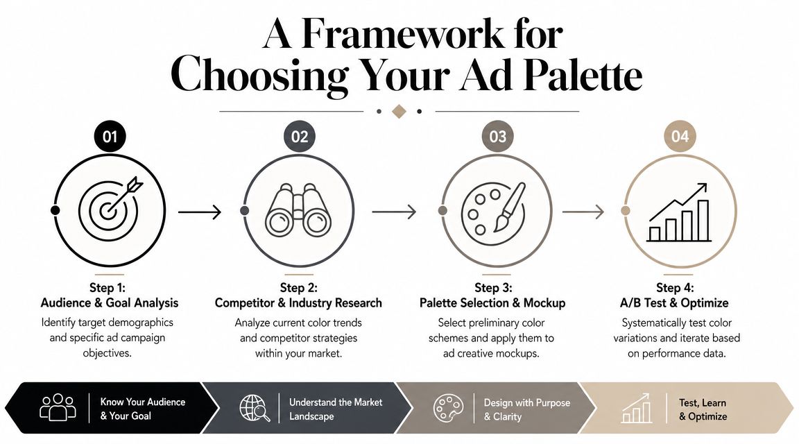
Start with the conversion event
Pick the action before you pick the color. Quote request, trial start, demo booking, purchase, lead form completion. Each asks for a different level of urgency and trust, so each needs a different visual balance.
High-intent remarketing can carry more contrast and stronger CTA emphasis. Cold prospecting usually needs more restraint, because aggressive color treatment can make the ad look cheap before the message has earned attention.
This is the mistake generic agencies keep making. They start with mood boards and brand adjectives. Performance teams start with the click, the next page, and the margin target.
Audit the auction, not your preference
Open the live results and look at what buyers see. Review competitors across display placements, YouTube thumbnails, landing pages, and any visual assets supporting paid traffic.
You are looking for two things:
Category signals: the colors and contrast patterns that make an offer look credible in your market
Pattern gaps: places where the entire category has drifted into sameness and you can stand out without looking risky
A finance advertiser may need visual restraint because trust carries the conversion. A DTC promo campaign may need sharper contrast because speed matters more. The right answer comes from the auction environment, not from someone saying blue means trust and red means urgency.
Teams scaling visual campaigns should also account for placement behavior across display ad networks. The same palette can look controlled in one placement and noisy in another.
Build a palette that can be tested
Keep the system simple enough to isolate in Google Ads. If every campaign uses a different set of colors, you are not building a palette. You are producing design variance that muddies performance analysis.
Use a dominant color for brand recognition and one accent color for action emphasis. A restrained dominant-and-accent structure is a practical rule for ad creative because it gives the eye a clear focal point and keeps the CTA visually distinct, as noted earlier in the article.
Set hard rules:
Choose the dominant color first. It should carry most of the layout and hold the ad together.
Choose one accent color second. Give it a single conversion job.
Define exact usage. CTA button, price callout, form highlight, or one icon treatment. Pick one or two placements and stop there.
Check the palette in real ad sizes. Mobile placements expose weak contrast fast.
If your team cannot write these rules down in a sentence, the palette is too loose to test.
Adjust for market and device constraints
Color decisions break when advertisers assume every region and screen interprets them the same way. They do not. A palette that feels premium on desktop can lose contrast on mobile. A color combination that looks credible in one market can feel generic or low-trust in another.
Review top-performing ads by geography, device, and audience stage. Then make controlled adjustments. Do not rebuild the whole visual identity every quarter. Tighten the system and test specific variables inside a broader workflow for advanced Google Ads management.
Strong palettes assign visual priority. Weak palettes reflect internal opinions.
Run one quick audit today. Pull your top three creatives, blur the copy, and ask whether the color system still shows the user what matters first and what to click next. If the answer is no, your palette is not a brand asset. It is a conversion problem.
How to A/B Test Color in Google Ads
Color testing only becomes useful when it's structured. Randomly swapping button colors across a few assets and calling it a test is how teams waste time and convince themselves they're being data-driven.

A real test isolates color as much as possible, keeps the offer stable, and judges results by business metrics instead of vanity metrics alone. If you're using automation heavily, it helps to pair your creative review with tools built for advanced Google Ads management so color tests sit inside a broader optimization system rather than a disconnected design experiment.
Test one color variable at a time
You need control. If Version A changes background color, CTA color, headline length, and image crop, the result is meaningless. You won't know what moved performance.
Here's the structure I recommend:
Display ads: Keep copy, image subject, layout, and offer identical. Change only the background color family or CTA accent.
Discovery and demand gen style assets: Test one visual theme against another, but keep composition and message hierarchy aligned.
Performance Max: Separate color directions into distinct asset groups when possible, so Google has cleaner creative clusters to learn from.
Landing pages: Keep the ad-to-page visual story consistent, then test the page CTA treatment independently.
For teams serious about post-click performance, this guide to A/B testing landing pages is the right companion process. Testing ad color while leaving a mismatched landing page untouched creates dirty data.
Match metrics to business outcomes
CTR matters, but it's not enough. Bright, aggressive palettes can attract cheap clicks that don't convert. Cleaner, more category-appropriate palettes can look less flashy and still produce stronger qualified traffic.
Track color tests against:
Metric |
Why it matters in color testing |
|---|---|
CTR |
Tells you whether the creative gets attention |
CVR |
Shows whether attention turns into action |
CPA |
Reveals whether the color attracts efficient traffic |
ROAS |
Keeps ecommerce teams focused on revenue quality |
Quality Score signals |
Helpful when ad relevance and landing page clarity are involved |
The right winner depends on account economics. If one palette lifts CTR but drags down conversion quality, it didn't win. It got more curiosity clicks.
Use platform structure correctly
The mechanics matter.
For Display and image-based campaigns, upload tightly matched variants and avoid rotating too many unrelated concepts in the same ad group. For Performance Max, group assets by visual theme so the system isn't mixing conflicting color languages inside one learning pool. For remarketing, test stronger accents because the audience already knows you. For cold traffic, test category-fit palettes first, then push contrast.
This walkthrough is worth watching if you want a practical view of testing discipline in motion.
One more point. Specialist PPC consultants usually run tighter tests because they're closer to the account. They don't need approval chains across creative, strategy, and client services just to launch two controlled variants. That speed matters. Faster testing means faster learning, and faster learning usually beats agency process theater.
Improve Performance with Accessible Color Choices
Accessibility isn't a compliance footnote. It's part of conversion optimization.
A lot of ad teams still treat accessibility as a design checklist item after the campaign is built. That's backward. If users can't comfortably read the headline, identify the CTA, or distinguish key elements on a small screen, your creative is underperforming before the auction data even comes in.
Research-based marketing guidance has started pushing this harder: inaccessible color choices can reduce readability and conversion, and many PPC teams still lack a system for testing how color behaves with color-vision deficiencies, small screens, and regional differences, as discussed in Rasmussen University's summary of color psychology in marketing.
Accessibility is conversion optimization
Low contrast hurts more than aesthetics. It creates friction.
That friction shows up in ways PPC teams care about:
Weak message pickup: Users don't immediately understand the offer
Poor CTA recognition: The action element doesn't look clear or clickable
Mobile readability problems: Small screens punish subtle color differences
Landing page disconnect: The click arrives on a page that's harder to use than it should be
If you're improving post-click performance, this guide to Google Ads landing page optimization fits directly into the same workflow.
What strong PPC teams actually check
You don't need a huge accessibility committee. You need a repeatable review process.
Use this short checklist before launch:
Contrast check: Body text, headlines, and buttons must remain readable on mobile.
Color-blind safety: Don't rely on color alone to communicate action or status.
Small-screen review: Preview creatives at realistic mobile sizes, not just full-screen mockups.
Cross-market review: Validate that the palette still feels appropriate when campaigns run in different regions.
A readable ad usually performs better for everyone, not just for users with accessibility needs.
This is one of the easiest quality upgrades in paid media because it forces the team to prioritize clarity. And clarity is what converts.
Stop Guessing and Start Optimizing Your Ad Colors
Color psychology in advertising matters, but not in the way most agencies explain it. The winning approach isn't memorizing what each color supposedly means. It's treating color like any other PPC lever. Define the job, control the variable, test it cleanly, and judge it by business outcomes.
That's the standard CMOs should expect. If your current agency is still talking about warm colors and cool colors without showing how creative choices affect CTR, CVR, CPA, or ROAS, they're not managing performance. They're managing opinions.
Specialist PPC consultants tend to do this better because they stay close to the account, move faster, and build tests that answer useful questions. That's what high-spend advertisers need. Not more theory. Better decisions.
If you want a senior-level second opinion on your Google Ads creative strategy, Come Together Media LLC offers a more practical alternative to bloated agency management. You get direct PPC expertise, transparent guidance, and a sharper testing mindset built around conversion performance, not vague creative talk.
