7 Actionable Analytics Report Example Templates for 2025
- Nov 17, 2025
- 18 min read
Data without context is just noise. If you’ve ever stared at a dense, 20-page analytics report from a bloated, over-priced agency wondering what it all means for your bottom line, you know this firsthand. These generic reports, often filled with vanity metrics and confusing jargon, do little to inform your actual business strategy. They tell you what happened but rarely why it happened or, more importantly, what to do next. This is a common pitfall when working with large, impersonal firms that pass your account to a junior analyst who lacks specialized, individual expertise.
As an expert Google Ads consultant, I see this gap constantly. Small and midsize businesses need more than just data dumps; they need actionable intelligence. A well-crafted analytics report example serves as a blueprint, translating raw numbers into a clear narrative about your PPC performance, customer behavior, and growth opportunities. It’s the difference between guessing and making informed decisions that directly impact your return on ad spend (ROAS).
This listicle cuts through the clutter. We’re going straight to the source, providing a curated collection of high-quality analytics report examples and templates from leading platforms. Each entry includes screenshots, direct links, and a strategic breakdown of how to adapt it for your specific business needs, especially for Google Ads campaigns. You'll find everything from executive summary slides to comprehensive dashboards. For more inspiration on practical analytics report examples and templates that drive real growth, explore these resources: 7 Business Intelligence Dashboard Examples to Steal in 2025. Let’s transform your reporting from a routine task into your most powerful strategic asset.
1. Google Looker Studio – Official Report Gallery
When you need an analytics report example that's both high-quality and immediately usable, the best place to start is often the source. The Google Looker Studio (formerly Data Studio) Official Report Gallery is an indispensable resource for any business running PPC campaigns, especially on Google Ads. It provides a curated collection of templates built and maintained by Google's own team, ensuring they align perfectly with the latest features and data connectors.
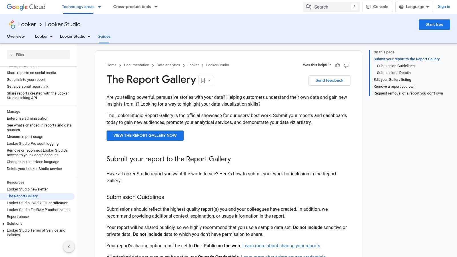
Unlike bloated agencies that charge a premium for custom dashboard setups that are often just modified free templates, this gallery empowers you to create sophisticated reports for free. The platform's standout feature is its "copy-and-use" functionality. You can browse templates for Google Ads, GA4, YouTube, and more, open one you like, and simply click "Make a copy." Looker Studio then prompts you to connect your own data sources, instantly populating the report with your business's live data.
Strategic Analysis & Actionable Takeaways
The primary advantage here is speed and reliability. Instead of waiting weeks for an agency to build a Google Ads performance dashboard from scratch, you can deploy a comprehensive, multi-page report in minutes. This is a game-changer for businesses that need expert-level reporting without the expert-level price tag. It allows you, or a specialized consultant, to focus resources on analysis rather than setup.
Key Insight: The official templates serve as a masterclass in data visualization best practices. Observe how Google structures its own reports: the top-left corner is reserved for high-level KPIs like Clicks and Cost, while more granular data like campaign-level performance is positioned further down. This strategic layout guides the viewer's eye from summary to detail.
Practical Application Tips
Customize for Your KPIs: Don't just use the template as-is. An expert consultant will identify the core metrics that drive your business and ensure they are front and center. For an e-commerce store, this means adding Return On Ad Spend (ROAS) and Conversion Value to the main summary page.
Blend Data Sources: Use the Google Ads template as a base, then add a new data source like Google Analytics 4. This allows you to create charts that compare ad-driven traffic () with organic or direct traffic, providing a holistic view of your marketing funnel. For a deeper understanding of how to interpret these blended metrics, you can learn more about how to measure your advertising effectiveness.
Set Up Automated Delivery: Use the "Schedule email delivery" feature to send a PDF of the report to stakeholders every Monday morning. This automates the reporting process, ensuring key decision-makers stay informed without manual intervention.
Feature Highlights | Why It Matters for SMBs |
|---|---|
Free Access & Copying | No budget required for professional-grade reporting tools. |
Google-Maintained | Templates are always up-to-date with API changes. |
Direct Data Connection | Eliminates manual data entry and ensures real-time accuracy. |
Access: Free with a Google account.Website: https://cloud.google.com/looker/docs/studio/the-report-gallery
2. Tableau – Dashboard Examples (Tableau Public)
While Google’s tools are essential, stepping outside the ecosystem provides a masterclass in data storytelling. The Tableau Public Dashboard Examples gallery is a premier destination for finding an analytics report example that pushes creative and analytical boundaries. It's a vast library of interactive dashboards built by a global community of data analysts, offering inspiration far beyond standard PPC reporting.
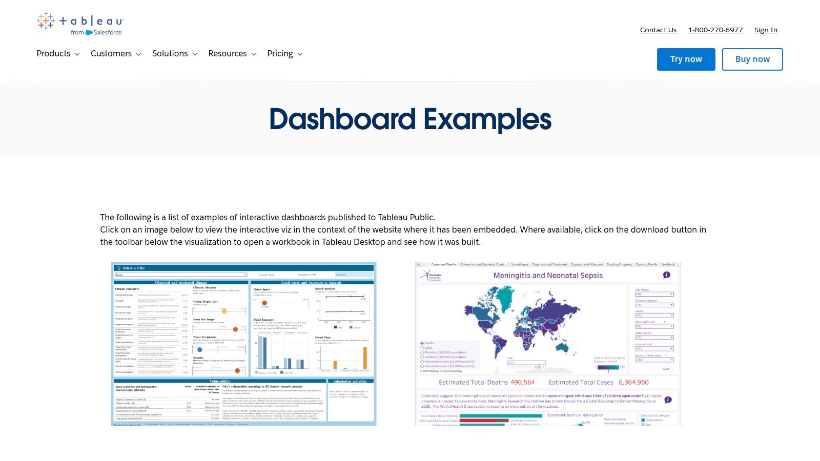
Unlike the rigid, cookie-cutter templates an overpriced agency might use, Tableau Public showcases the art of the possible in data visualization. You can interact with real-world dashboards, filter data, and in many cases, download the original Tableau workbook. This "look under the hood" functionality allows you to deconstruct how complex visualizations are built, a learning opportunity that bloated agencies keep behind a paywall. For an individual practitioner, this is like getting free access to a data visualization consultant.
Strategic Analysis & Actionable Takeaways
The key advantage of Tableau Public is exposure to diverse analytical perspectives. You can see how a retail company visualizes sales funnels or how a logistics firm tracks performance KPIs, then adapt those concepts to your own Google Ads reporting. This cross-industry inspiration helps you break free from generic dashboards and build reports that truly answer your specific business questions—a level of customization that requires specialized, individual expertise, not a one-size-fits-all agency approach.
Key Insight: The best dashboards on Tableau Public excel at telling a clear story. They often use a "guided analytics" approach, where the initial view presents a high-level summary, and interactive filters or drill-down actions allow the user to explore deeper questions. This is a powerful technique for executive reports, as it satisfies both the need for a quick summary and the desire for granular detail.
Practical Application Tips
Reverse-Engineer a Viz: Find a marketing dashboard you admire and, if available, download the workbook. Analyze its data sources, calculated fields, and filter actions. Try to rebuild a similar visualization using your own Google Ads data to learn the mechanics and apply advanced techniques.
Focus on 'Chart Type' Inspiration: Don't just look at marketing dashboards. Explore visualizations from completely different fields like sports or science. You might discover that a Sankey diagram used to show energy flow is the perfect way to visualize your customer's journey from first ad click to final conversion.
Borrow Layout and UX Ideas: Pay close attention to how creators use color, spacing, and interactive elements. A well-designed dashboard is intuitive. Apply these user experience principles to your Looker Studio or internal reports to make them more engaging and easier for stakeholders to understand.
Feature Highlights | Why It Matters for SMBs |
|---|---|
Vast Public Gallery | Free access to thousands of diverse, real-world reporting examples. |
Downloadable Workbooks | Offers a hands-on way to learn advanced data viz techniques without cost. |
Interactive Dashboards | Provides a tangible feel for how data can be explored, not just presented. |
Access: Free to browse and interact; a free Tableau Public account is needed to download workbooks.Website: https://www.tableau.com/dashboard-examples
3. Microsoft Power BI – Template Apps via AppSource
For businesses operating within the Microsoft ecosystem, finding a robust analytics report example means turning to Power BI. The Template Apps available through Microsoft AppSource are a powerhouse for companies that need enterprise-grade reporting without the slow, costly development cycles often associated with bloated agencies. These are pre-packaged, installable reports that cover everything from marketing and sales to finance.
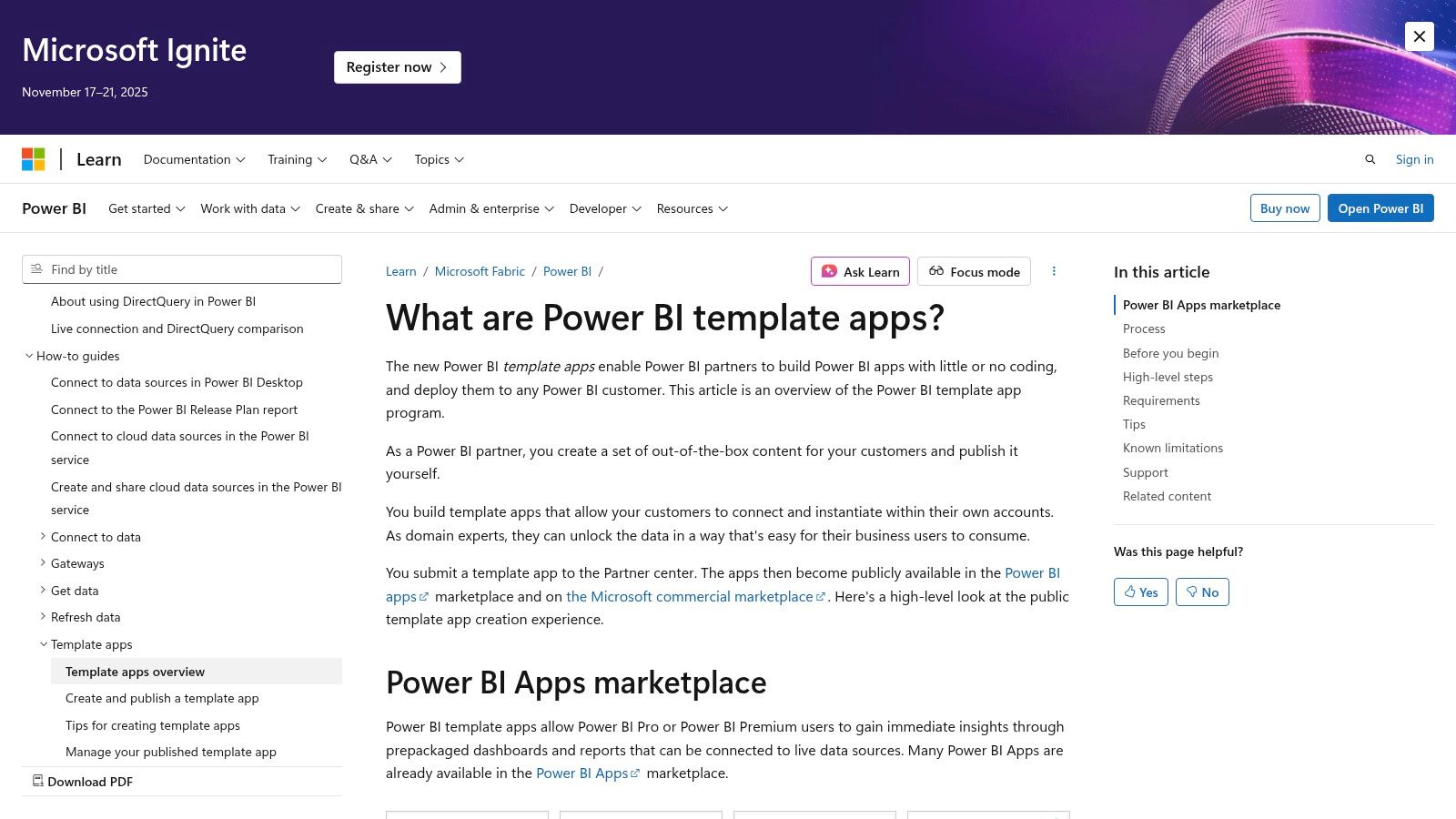
Unlike open-source galleries, AppSource offers a curated marketplace of both free and paid templates built by Microsoft and trusted partners. The standout feature is their one-click installation process. You can find an app, install it directly into your Power BI tenant, and connect it to your live data sources (like Google Ads, Salesforce, or Dynamics 365). This transforms a complex setup process into a simple configuration task, delivering a fully functional dashboard in minutes.
Strategic Analysis & Actionable Takeaways
The primary advantage here is governance and scalability, especially for organizations that need controlled data access. While an individual expert consultant can build a custom report, these template apps provide a vetted, secure foundation that IT departments trust. This allows marketing teams to get the analytics they need without navigating internal red tape, a common bottleneck when working with large, inflexible agencies that struggle with enterprise security protocols.
Key Insight: Power BI templates emphasize data modeling and relationships. Before visualizing the data, the template app creates a semantic layer. This means you can ask more complex questions, like "How did ad spend on non-brand keywords in the last 30 days influence the sales pipeline for our enterprise product line?" This level of integrated analysis is where Power BI truly shines.
Practical Application Tips
Filter AppSource for Your Niche: Use the filters in AppSource to narrow down templates by category (e.g., "Marketing") and connector (e.g., "Google Ads"). This helps you quickly find a relevant starting point for your PPC reporting.
Customize the Underlying Model: Once installed, don't be afraid to edit the report. An individual expert can use Power BI Desktop to open the .PBIX file and add custom measures using DAX (Data Analysis Expressions). For example, create a "Cost Per Lead (CPL)" measure that is specific to your business logic. For more ideas on what to track, explore these tips on paid search analytics to outsmart your agency.
Leverage Organizational Content Packs: After customizing a template, you can republish it as an "organizational app." This allows you to distribute a standardized, company-branded version of the report to different teams, ensuring everyone is looking at the same version of the truth.
Feature Highlights | Why It Matters for SMBs |
|---|---|
Installable Template Apps | Provides a complete, working report and dashboard instantly. |
Enterprise Governance | Securely deploy and share reports with controlled permissions. |
Strong Data Modeling | Enables deeper, cross-functional analysis beyond simple charts. |
Access: Requires Power BI licensing (Pro/PPU) for most apps.Website: https://learn.microsoft.com/en-us/power-bi/connect-data/service-template-apps-overview
4. Canva – Online Report Templates/Report Maker
While live dashboards are essential for day-to-day monitoring, sometimes you need a static, beautifully designed analytics report example for a board meeting, client presentation, or executive summary. This is where Canva excels. It provides a massive library of professionally designed report templates that prioritize visual appeal and clear communication over real-time data connectivity.
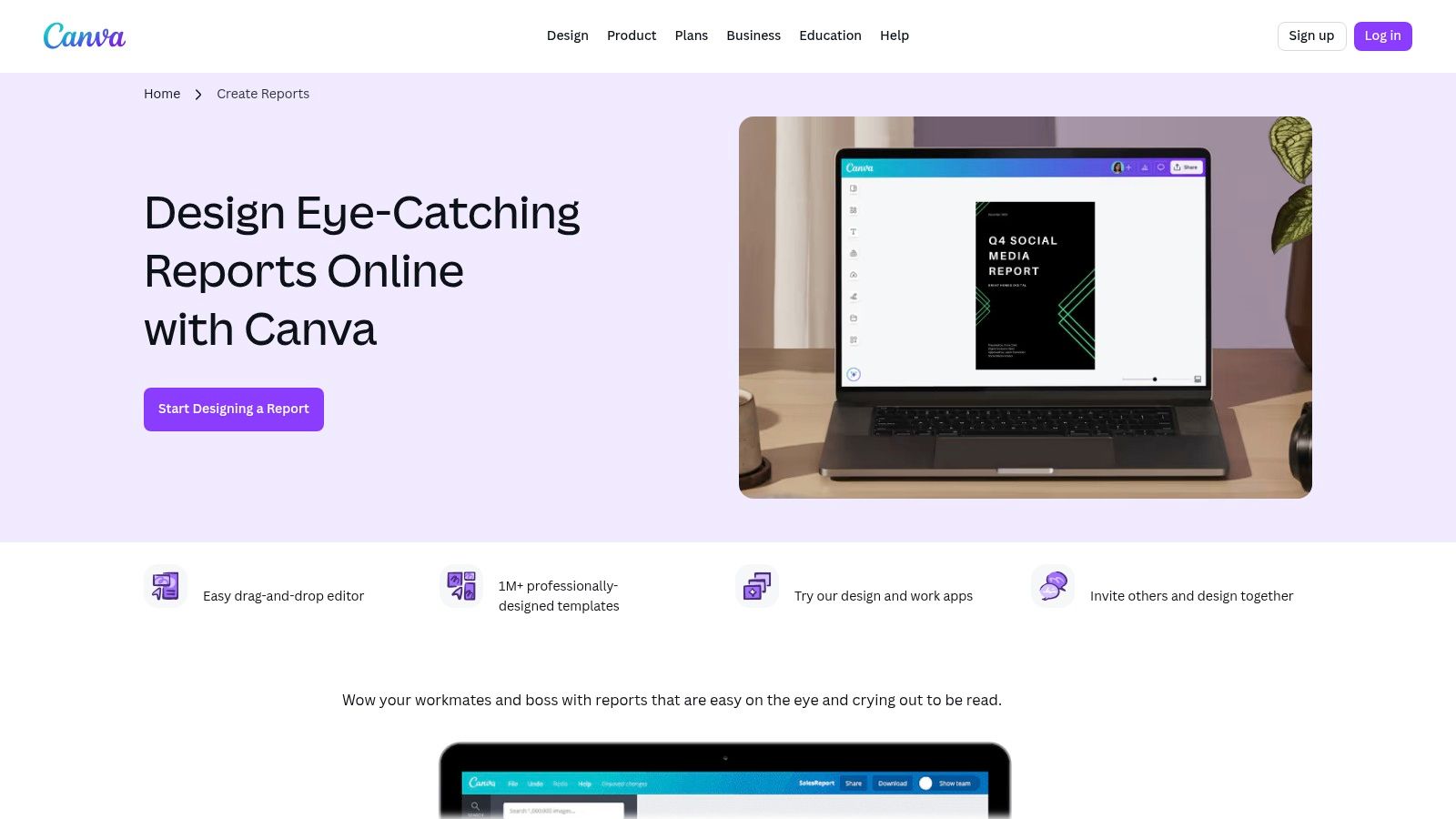
Unlike live data tools that require technical setup, Canva is a design-first platform. Its strength lies in the drag-and-drop editor, which allows an individual to create polished, on-brand documents in minutes without a design team. You can take the key performance indicators (KPIs) from your Google Ads dashboards and place them into a compelling narrative format that is easy for stakeholders to digest, without the complexity of a live data environment.
Strategic Analysis & Actionable Takeaways
The key advantage of using Canva for reporting is control over the narrative. A live dashboard can be overwhelming for a non-technical audience. A Canva report, however, allows a specialized consultant to curate the data, add annotations, and frame the results with strategic commentary. This is particularly valuable for presenting findings and recommendations, not just raw numbers. It transforms a data dump into a strategic asset, something large agencies often fail to do.
Key Insight: Use Canva to create a "top-sheet" or executive summary that sits on top of your more detailed live dashboards. This summary should highlight the 3-5 most critical metrics and provide a written analysis of what they mean for the business. This approach caters to busy executives who need the bottom line first.
Practical Application Tips
Create a Reusable Template: Start with a Canva template you like and customize it with your company's logo, colors, and fonts using the Brand Kit feature. Save this as your master "Monthly PPC Report" template. Each month, you can simply duplicate it and update the numbers and commentary.
Visualize the Funnel: Use Canva’s icons and chart elements to visually represent your Google Ads funnel. Start with Impressions at the top, followed by Clicks (CTR), and then Conversions (Conversion Rate). This simple visualization can be more impactful than a complex table for explaining performance.
Add Context and Next Steps: A Canva report isn't just for data; it's for analysis. An expert will add text boxes next to key charts with headings like "What This Means" and "Recommended Actions." For example, if Cost Per Acquisition (CPA) is rising, your note could recommend reallocating the budget from an underperforming ad group.
Feature Highlights | Why It Matters for SMBs |
|---|---|
Drag-and-Drop Editor | No design team needed to create a professional-looking report. |
Vast Template Library | Quickly find a layout suited for marketing, social, or executive reports. |
Export to PDF/PNG | Easily share static, non-editable reports with clients or leadership. |
Access: Free plan available; some templates and features require a Pro subscription.Website: https://www.canva.com/create/reports/
5. Envato Elements – Report and Analytics Report Templates
When you need an analytics report example with a high degree of creative polish for presentations, Envato Elements is a go-to resource. It operates on a subscription model, giving you unlimited access to a massive library of design assets. This includes professionally designed report templates for PowerPoint, Google Slides, Keynote, and even Figma, making it ideal for creating visually compelling narratives around your PPC data.
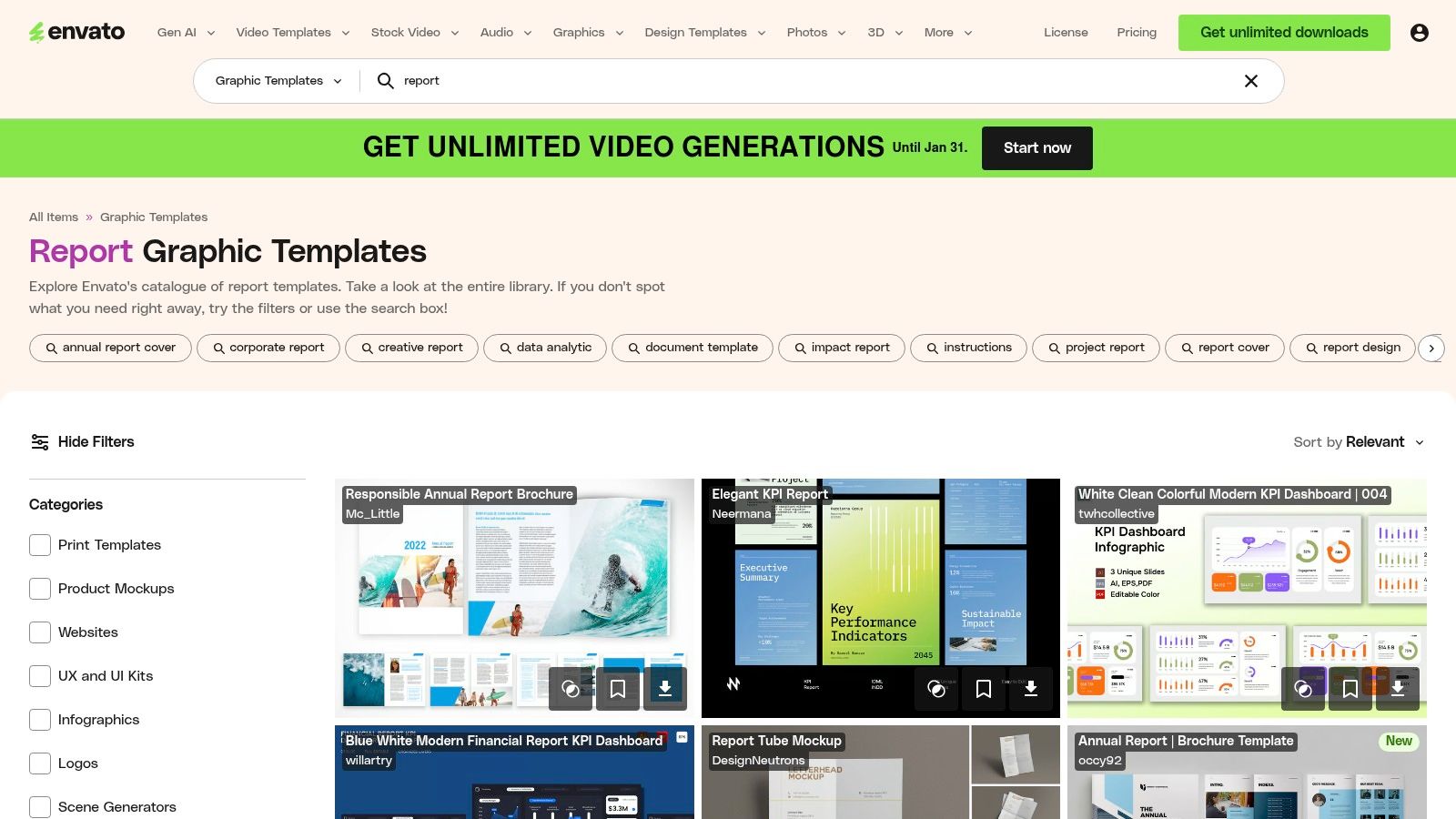
Unlike rigid software templates, Envato's offerings are built by a diverse community of designers. This variety allows you to find a style that perfectly matches your brand's aesthetic for stakeholder meetings or client reviews. For a small monthly fee, you can download as many templates as you need, a far more cost-effective approach than hiring an expensive agency to design custom slide decks for every quarterly review. You get agency-level design without the slow turnaround times and high costs.
Strategic Analysis & Actionable Takeaways
The primary advantage of Envato Elements is its versatility for offline reporting. While live dashboards are essential for daily monitoring, polished slide decks are crucial for communicating strategic insights to executives or clients who may not be in the weeds of Google Ads. These templates provide a structured, professional framework, allowing an individual specialist to focus on crafting the story your data tells, rather than wrestling with slide layouts and color palettes.
Key Insight: The best templates on Envato Elements are designed for storytelling. They often include slides for outlining objectives, showcasing key results with large-format charts, and providing a dedicated space for analysis and next steps. This structure forces you to move beyond simply presenting data and toward delivering actionable business intelligence.
Practical Application Tips
Create a Master Template: Download a few templates you like and combine the best slides into a single, branded master template for your business. Include placeholders for key Google Ads metrics like Cost, Conversions, CPA, and ROAS. This streamlines your monthly or quarterly reporting process significantly.
Focus on Key Visuals: Don't try to replicate your entire Google Ads dashboard in a PowerPoint. Instead, use the templates to highlight the most critical trends. For instance, dedicate one slide to a waterfall chart showing the month-over-month change in conversion volume and another to a pie chart breaking down ad spend by campaign type (e.g., Search, Performance Max, Display).
Pair with Live Data: Use the slide deck to present your strategic summary and key findings. For deeper dives during the meeting, have a link ready to a live Looker Studio dashboard. This combined approach gives your audience both the high-level narrative and the ability to explore the granular data if needed.
Feature Highlights | Why It Matters for SMBs |
|---|---|
Unlimited-Download Subscription | Extremely cost-effective for creating multiple reports. |
Multi-Format Templates | Supports your existing software (PPT, Google Slides, Keynote). |
Included Commercial License | Use templates for any client or commercial presentation legally. |
Access: Paid subscription (starts at $16.50/month).Website: https://elements.envato.com/graphic-templates/report
6. SlideModel – Analytics/Dashboard Report Templates (PowerPoint/Google Slides)
While live dashboards are essential for real-time monitoring, static presentations remain a cornerstone of executive and client communication. SlideModel offers a powerful collection of professionally designed analytics report example templates for PowerPoint and Google Slides, bridging the gap between raw data and a compelling, digestible narrative for stakeholders. These templates are specifically built for summarizing performance in a clear, visually engaging format.
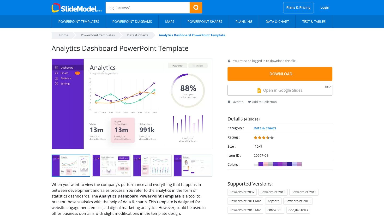
Unlike bloated agencies that might repackage basic screenshots into a generic, uninspired slide deck, SlideModel empowers you to create polished, professional reports quickly. The core value lies in its pre-built, data-driven chart and KPI layouts. Instead of spending hours formatting shapes and aligning text boxes in PowerPoint, an individual expert can download a template, input key metrics, and have a client-ready presentation finished in a fraction of the time. This is a significant advantage for producing recurring monthly or quarterly business reviews with efficiency and polish.
Strategic Analysis & Actionable Takeaways
The primary benefit of using SlideModel is efficiency and professional polish for static reporting. Live dashboards are for exploration, but a PowerPoint or Google Slides report is for storytelling and decision-making. These templates provide the framework to tell a clear story with your PPC data, guiding your audience through the most important performance highlights, challenges, and next steps without overwhelming them.
Key Insight: A static report forces you to curate your data. Unlike an interactive dashboard where a client can get lost in the weeds, a slide deck guides them through a specific narrative. A skilled consultant uses this to highlight key wins, explain specific performance dips with context, and propose a clear, data-backed action plan.
Practical Application Tips
Create a Master Template: Download a template you like and customize it with your company's logo, brand colors, and standard KPIs. Save this as your "Monthly PPC Report Master" to ensure consistency and speed up production each month.
Pair with Live Data: Manually input your high-level KPIs (e.g., Total Spend, Conversions, ROAS) from your Google Ads account or Looker Studio dashboard onto the summary slide. Use the subsequent slides to drill down into specific campaigns or ad groups that drove those results.
Focus on the "So What?": Each slide should have a clear takeaway. Use the "notes" section in PowerPoint or Google Slides to script your talking points, explaining what the data on the slide means for the business and what action should be taken as a result.
Feature Highlights | Why It Matters for SMBs |
|---|---|
Downloadable PPT/Slides Files | Easily integrates into existing business presentation workflows. |
Editable, Data-Driven Charts | Speeds up the process of visualizing performance data manually. |
Professional, Consistent Design | Delivers executive-level polish without needing a graphic designer. |
Access: Requires a subscription (plans vary).Website: https://slidemodel.com/templates/analytics-dashboard-powerpoint-template/
7. Databox – Marketing Report Examples + Plug-and-Play Dashboards
For small businesses and marketing consultants who need to report on multiple platforms beyond just Google's ecosystem, Databox provides a powerful solution. Their gallery of analytics report example templates is built for speed and efficiency, allowing you to connect over 130 different data sources and generate live, automated dashboards in minutes. This is a significant advantage over bloated agencies that often lock clients into a single reporting system or charge hefty fees for multi-platform integrations.
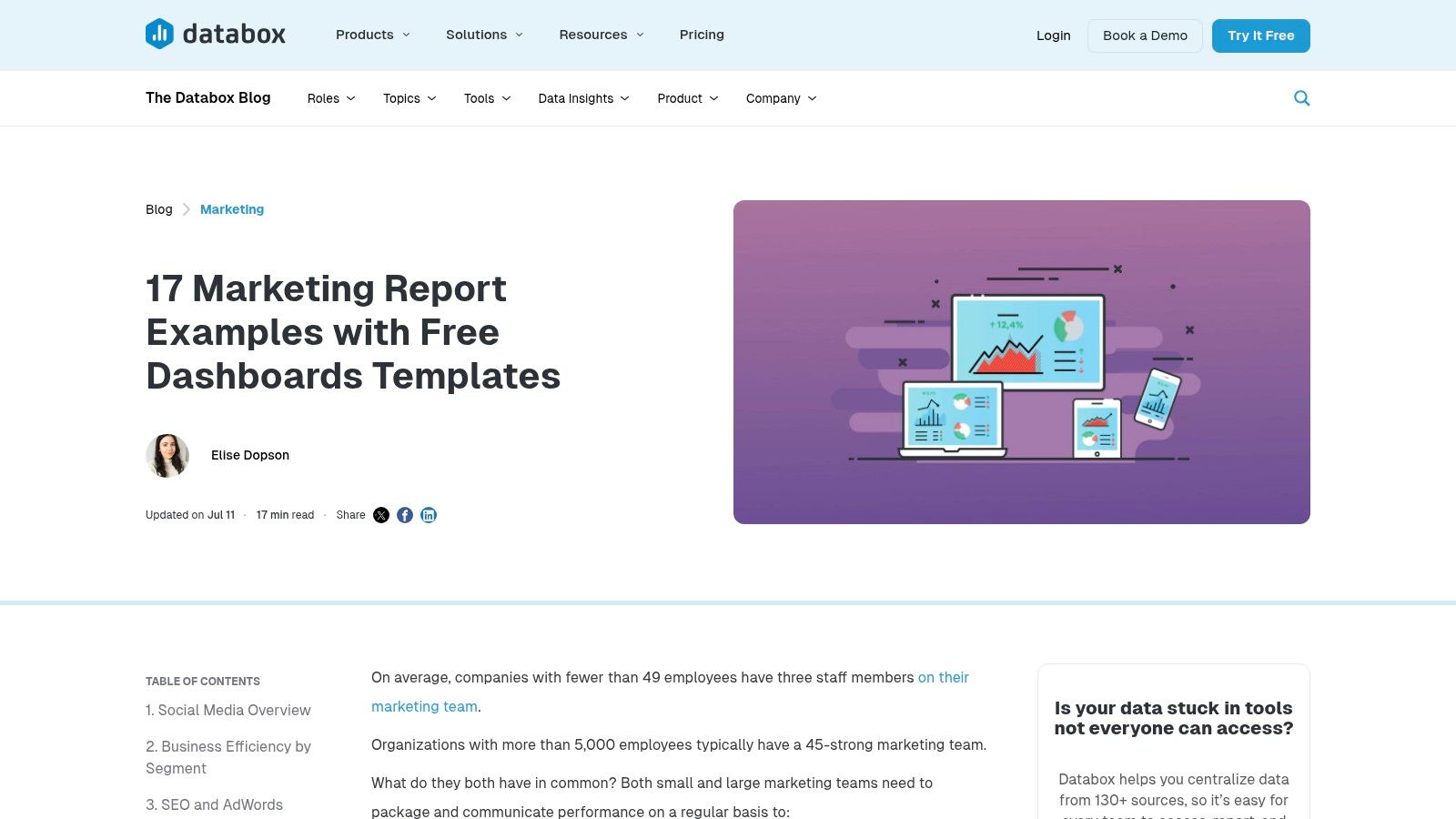
The platform’s core strength is its "plug-and-play" model. You can select a pre-built template for HubSpot, Facebook Ads, GA4, or a combination of sources, connect your accounts, and immediately have a functional report. This approach empowers users to bypass the technical setup and focus directly on the insights—a key benefit for an agile, results-driven individual consultant who values speed over the complex, time-consuming configurations common at large agencies.
Strategic Analysis & Actionable Takeaways
Databox excels at creating a unified view of your entire marketing funnel. While a large agency might silo your data, Databox is perfect for generating a quick, comprehensive overview that combines paid, organic, and CRM data. This is particularly valuable for individual consultants who manage multiple clients and need a scalable, repeatable reporting process that demonstrates holistic value.
Key Insight: The true power of Databox for a small business lies in its ability to democratize data. By connecting sources like Google Ads and HubSpot, you can instantly visualize how ad spend translates into qualified leads and sales pipeline, providing a clear ROI calculation that might otherwise require manual data wrangling in spreadsheets.
For those focused on social media advertising, understanding the source data is crucial. A solid grasp of Facebook Ads Manager reporting basics will help you better configure and interpret the metrics pulled into your Databox dashboard, turning it into an even more powerful tool for performance analysis. For more inspiration, explore these other examples of an analytical report designed to drive business growth.
Practical Application Tips
Create a "Source of Truth" Dashboard: Select a template that combines your most critical platforms, such as Google Ads, Google Analytics 4, and your primary CRM (e.g., HubSpot). This creates a single dashboard that tells the full story from first click to final sale.
Utilize Scheduled Snapshots for Client Reporting: Instead of manually compiling monthly PDFs, use Databox’s "Scheduled Snapshots" feature to email a link or PDF of the dashboard to clients or stakeholders on a recurring basis. This automates communication and keeps everyone aligned.
Set Custom Goals and Alerts: For each key metric on your dashboard, set a performance goal. Databox can then send you automated alerts if your campaigns are underperforming (e.g., CPA rises above $50), allowing you to take corrective action proactively.
Feature Highlights | Why It Matters for SMBs |
|---|---|
130+ Data Connectors | Easily create a holistic view of marketing performance in one place. |
Plug-and-Play Templates | Launch a professional, live-data report in minutes without technical skills. |
Automated Sharing | Streamlines client and stakeholder reporting, saving valuable time. |
Access: Paid plans required after a 14-day free trial.Website: https://databox.com/marketing-report-examples
Top 7 Analytics Report Examples Comparison
Tool | 🔄 Implementation complexity | ⚡ Resource requirements | 📊 Expected outcomes | 💡 Ideal use cases | ⭐ Key advantages |
|---|---|---|---|---|---|
Google Looker Studio – Official Report Gallery | 🔄 Low — copy-and-reconnect workflow; minimal setup | ⚡ Minimal — free with Google account; uses existing connectors | 📊 High-quality, product-aligned templates for GA4/Ads/YouTube; fast prototyping | 💡 Quick GA4/Ads/YT dashboards; rapid prototyping of analytics reports | ⭐ Maintained by Google; broad connector coverage; free to copy |
Tableau – Dashboard Examples (Tableau Public) | 🔄 Medium — interact and (optionally) download workbooks; learning curve to edit | ⚡ Low–Medium — free to browse; Tableau Desktop needed to edit (paid) | 📊 Real-world interactive visualizations; strong viz best-practice examples | 💡 Inspiration, visualization learning, public storytelling | ⭐ Large community library; many interactive, downloadable examples |
Microsoft Power BI – Template Apps via AppSource | 🔄 Medium‑High — installable apps require tenant/configuration | ⚡ Medium‑High — Power BI Pro/PPU or Premium often required | 📊 Production-ready, deployable reports with governed sharing | 💡 Enterprise deployments, standardized reporting (finance, marketing) | ⭐ Enterprise-friendly; full end-to-end templates and governance |
Canva – Online Report Templates/Report Maker | 🔄 Low — drag‑and‑drop design workflow; no live connectors | ⚡ Low — free tier; Pro/Teams for premium assets and brand kits | 📊 Polished, client-ready static reports and executive summaries | 💡 Rapid design of PDFs/slides; brand-consistent layouts for clients | ⭐ Fast to produce polished assets; low learning curve; collaboration |
Envato Elements – Report and Analytics Templates | 🔄 Low–Medium — download and adapt templates in design tools | ⚡ Medium — subscription for unlimited downloads and commercial license | 📊 Wide variety of professionally designed layouts across formats | 💡 Teams or designers needing many templates across formats | ⭐ Cost-effective at volume; multi-format coverage; commercial license included |
SlideModel – Analytics/Dashboard Templates | 🔄 Low — download PPTX slide packs and edit in PowerPoint/Google Slides | ⚡ Medium — subscription required; PowerPoint-centric workflow | 📊 Business-ready KPI slides for recurring monthly/quarterly reports | 💡 Executive decks and recurring presentation-focused reporting | ⭐ Time-saver for presentations; consistent, KPI-focused designs |
Databox – Marketing Report Examples & Plug‑and‑Play Dashboards | 🔄 Low–Medium — install templates and connect live data; scheduled refresh | ⚡ Medium — many connectors; 14‑day trial then paid plans for ongoing use | 📊 Live, automated dashboards with sharing and export for clients | 💡 Agencies/consultancies needing quick, recurring client dashboards | ⭐ Fast live connectivity; wide connector library; sharing/automation features |
Stop Paying for Data Dumps. Start Investing in Actionable Insights.
The journey through these diverse analytics report examples has one unifying theme: raw data is not the same as actionable intelligence. We’ve explored everything from the deep, customizable dashboards in Google Looker Studio and Tableau to the polished, presentation-ready templates from Canva and SlideModel. Each tool offers a unique pathway to transform overwhelming numbers into a clear, strategic narrative.
But the most powerful takeaway isn't found in a specific template or software. It's the shift in mindset from simply having data to actively using it. An effective analytics report doesn’t just show what happened; it illuminates why it happened and guides you on what to do next. It bridges the gap between performance metrics and profitable business decisions.
From Examples to Execution: Your Next Steps
You've seen what a high-quality analytics report example looks like. Now, it's time to build your own. Here’s how to move forward with purpose:
Define Your "One Thing": Before you open any tool, decide on the single most important question you need your report to answer. Is it "Which campaign is driving the most qualified leads?" or "What is our true Return on Ad Spend (ROAS) after accounting for all costs?" A focused question prevents a cluttered, meaningless report.
Match the Tool to the Task: Your needs dictate your tool. For live, interactive KPI tracking, Databox or Looker Studio are excellent choices. For a high-stakes monthly or quarterly business review with stakeholders, a curated PowerPoint from a SlideModel template might be more effective. Don't choose a tool just because it's popular; choose it because it solves your specific problem.
Establish a Reporting Cadence: Consistency is key. Decide if your report will be daily, weekly, or monthly. This cadence should align with your decision-making cycle. A daily report is essential for optimizing a new, high-spend Google Ads campaign, while a monthly summary is better for tracking long-term brand growth.
The Human Element: Why Your "Who" Matters More Than Your "What"
Perhaps the most crucial, and often overlooked, factor in analytics reporting is the human element. The most sophisticated Power BI dashboard is useless without a skilled analyst to interpret the data, spot the hidden trends, and translate those findings into a concrete action plan. This is where the difference between a bloated, overpriced agency and a dedicated, specialized consultant becomes crystal clear.
Large agencies often hand off reporting to junior-level staff who follow a rigid template. They deliver a "data dump"—a perfectly formatted PDF filled with charts and graphs that looks impressive but lacks strategic depth. You get numbers, but you don't get the "so what?" behind them. You pay a premium for overhead, not for expertise.
A specialized consultant, on the other hand, lives and breathes your data. They don't just build the report; they build the strategy from the report. They understand the nuance behind a drop in Click-Through Rate or a sudden spike in Conversion Value because they are actively managing the campaigns. They can tell you not just what to do, but why it will work, based on years of focused experience. Your investment goes directly toward expertise and results, not toward supporting a massive agency infrastructure. When you partner with an expert, you stop paying for data and start investing in insight.
Ultimately, every analytics report example we’ve covered is a means to an end. The end goal is not a prettier dashboard or a more detailed spreadsheet. It’s about achieving sustainable growth, maximizing your return on investment, and building a more profitable business, one data-driven decision at a time.
Tired of generic reports that don't drive results? At Come Together Media LLC, we transform your Google Ads data into a clear, actionable growth strategy, providing the expert analysis that generic agencies can't. Let’s build reports that lead to real revenue, not just more charts. Learn more about our specialized Google Ads management services.


Comments